Payments Censored
Overview
The co-founders of Travel & Payments, a payments consulting agency, had a bright idea: create a payment-themed party game to make their industry more interesting. Enter Payments Censored — a sleek game designed to entertain industry professionals.
It started as a one-off party hit but quickly evolved into a cobranded product for other companies. The goal was turning their idea into a professional, engaging design that struck the perfect balance between fun and corporate.
Challenge
The first draft kept things minimal and professional but revealed critical limitations when T&P started receiving interest from other companies wanting to create their own cobranded versions.
The original design was too rigid — featuring T&P's specific branding and messaging that couldn't easily adapt to different identities. It also did not leverage recognizable visual metaphors that would resonate with the target audience of payments professionals.
More importantly, the design lacked the flexibility to serve as a genuine marketing tool. It was essentially a one-off product rather than a scalable business opportunity that could generate revenue through partnerships and licensing.
Approach
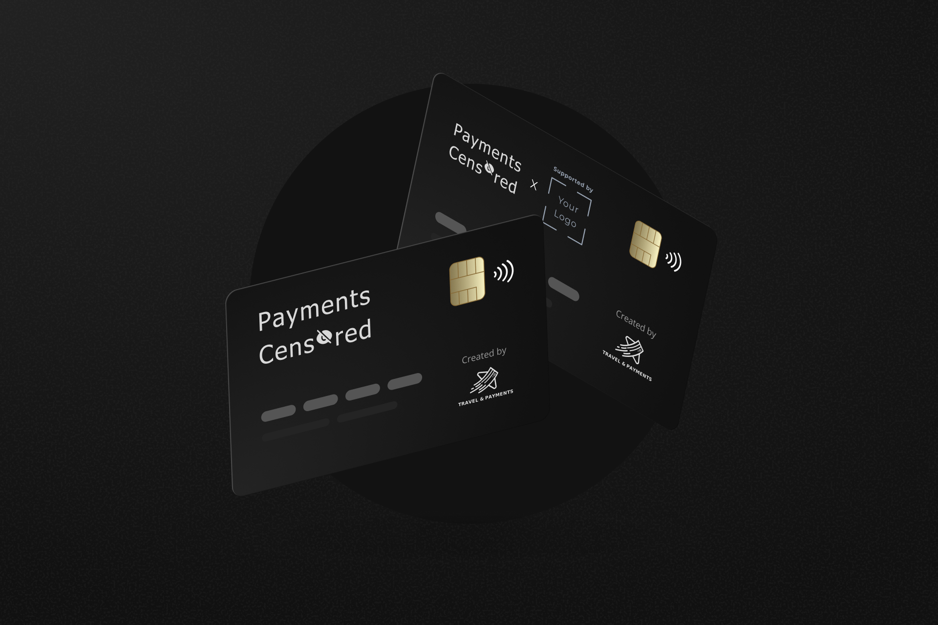
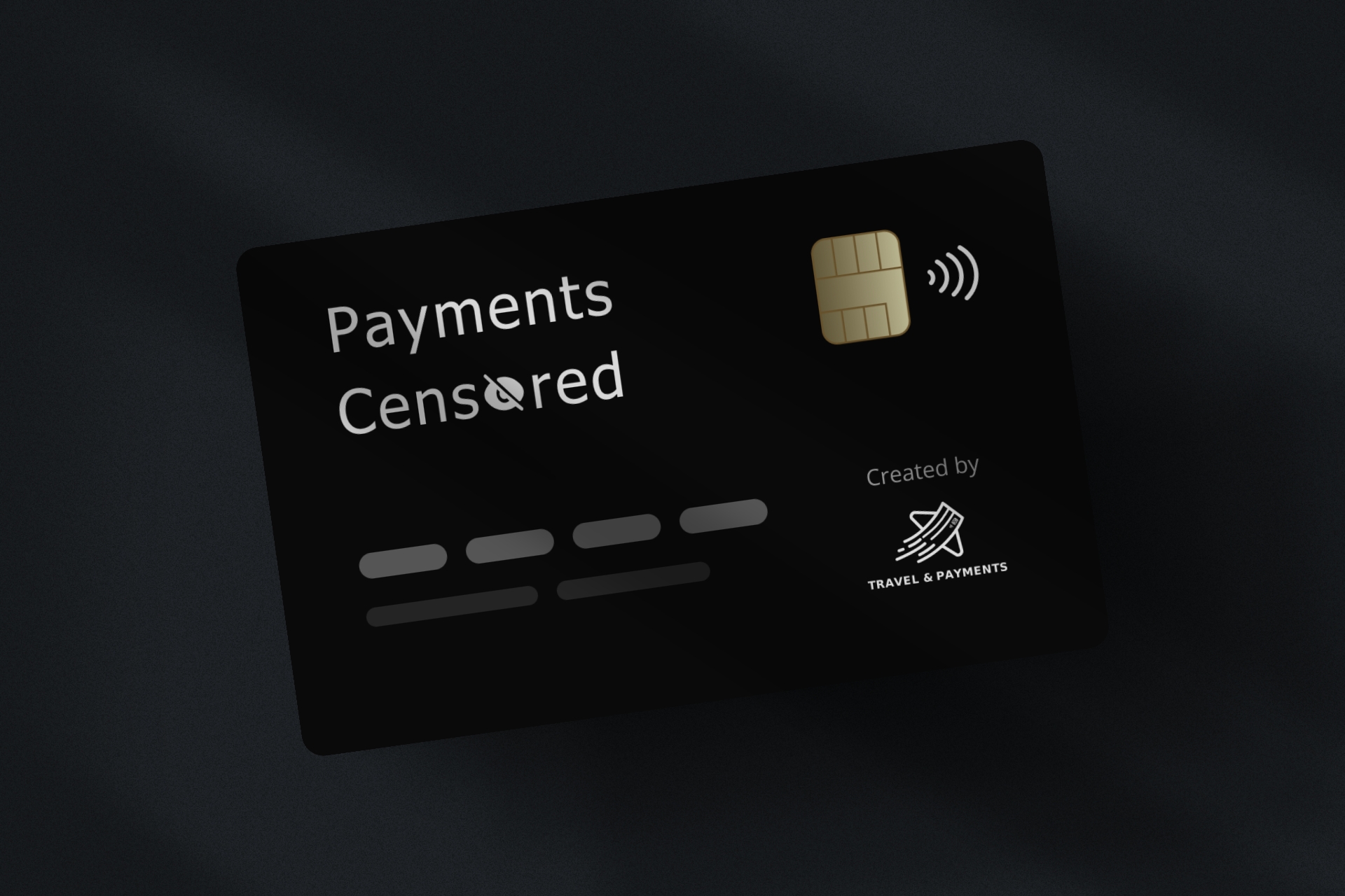
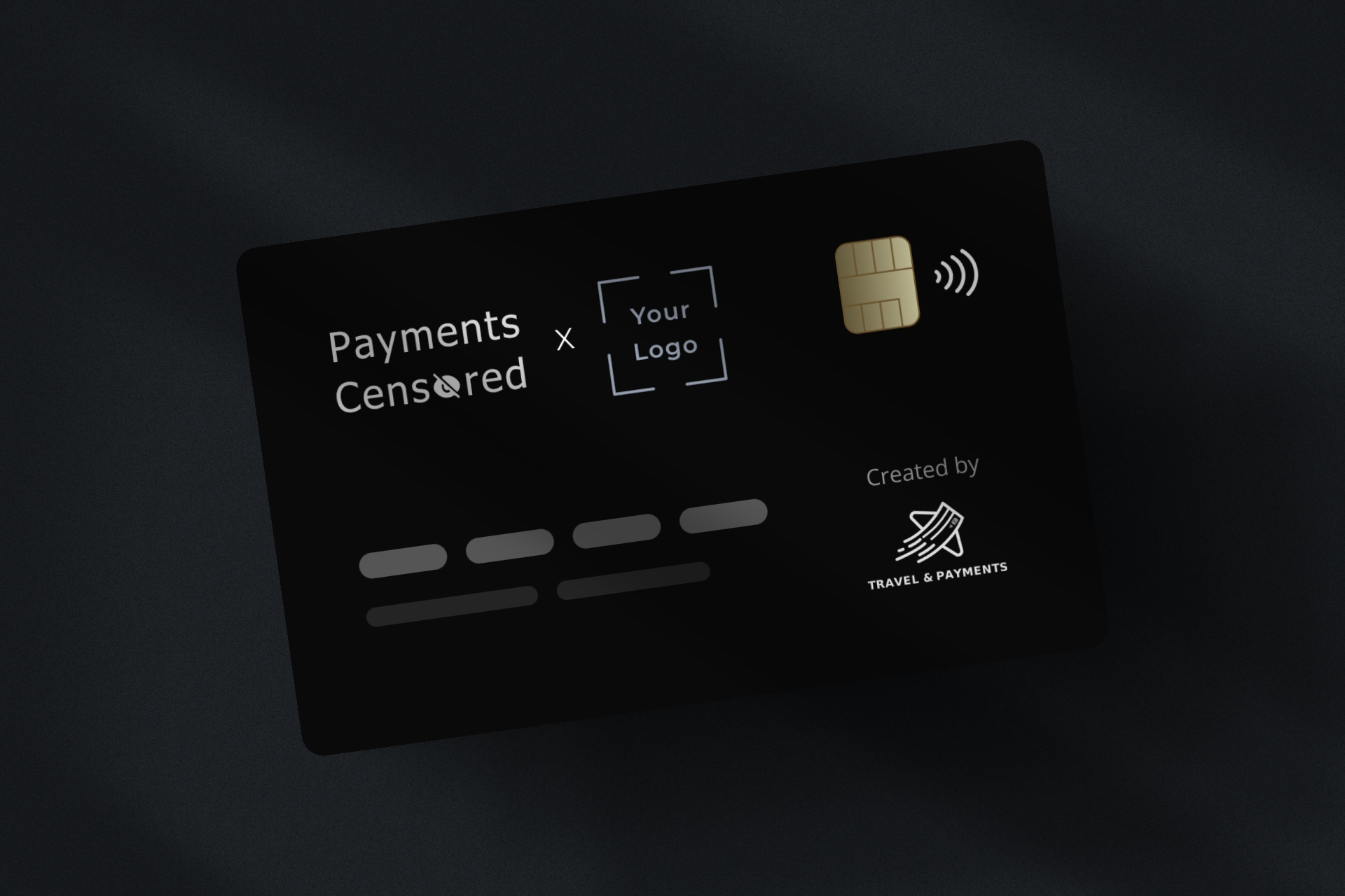
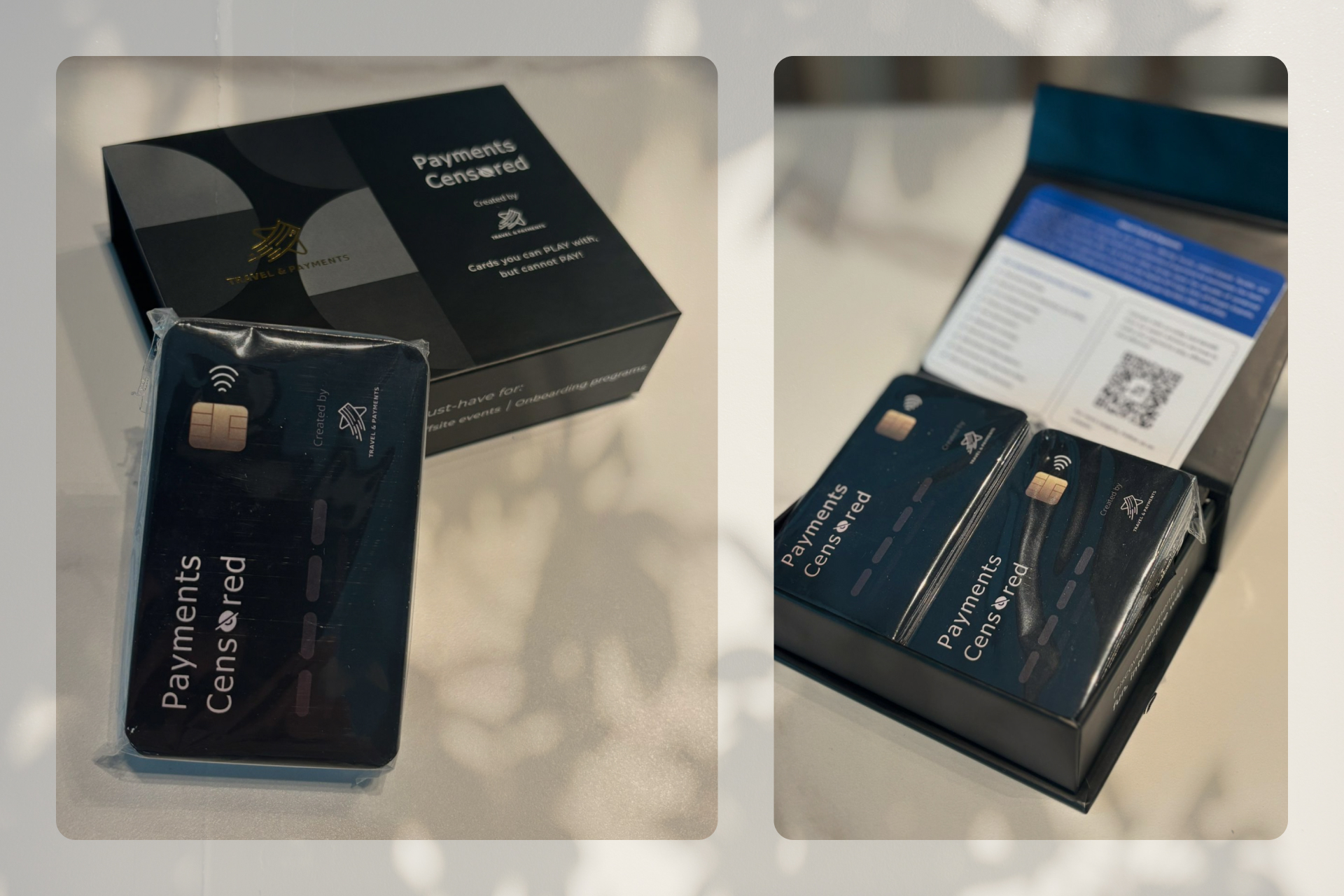
The solution required a complete strategic shift — from a static design to a flexible design system. Inspiration came from the payments industry itself: the ubiquitous credit card that everyone in the target audience would immediately recognize and relate to.
Visual Metaphor Strategy
The credit card layout wasn't just aesthetic — it was storytelling. By mimicking the familiar card design with digits, contactless symbols, and chip placement, the game instantly communicated its payments theme while feeling premium and professional.
Modular Branding System
A template-based approach was designed where partner companies could seamlessly feature their logos and messaging without compromising overall design integrity. The layout accommodated various logo sizes and orientations while maintaining visual hierarchy and readability.
Scalable Production
The new design considered real-world manufacturing constraints and costs. By creating standardized dimensions and print specifications, the game could be produced efficiently for different clients while maintaining consistent quality.
User Experience Considerations
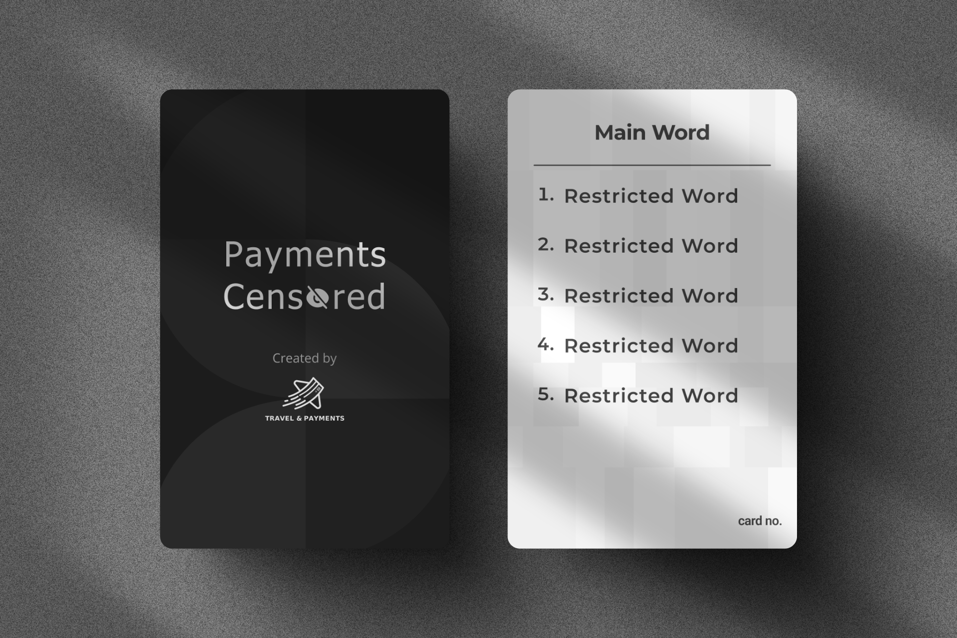
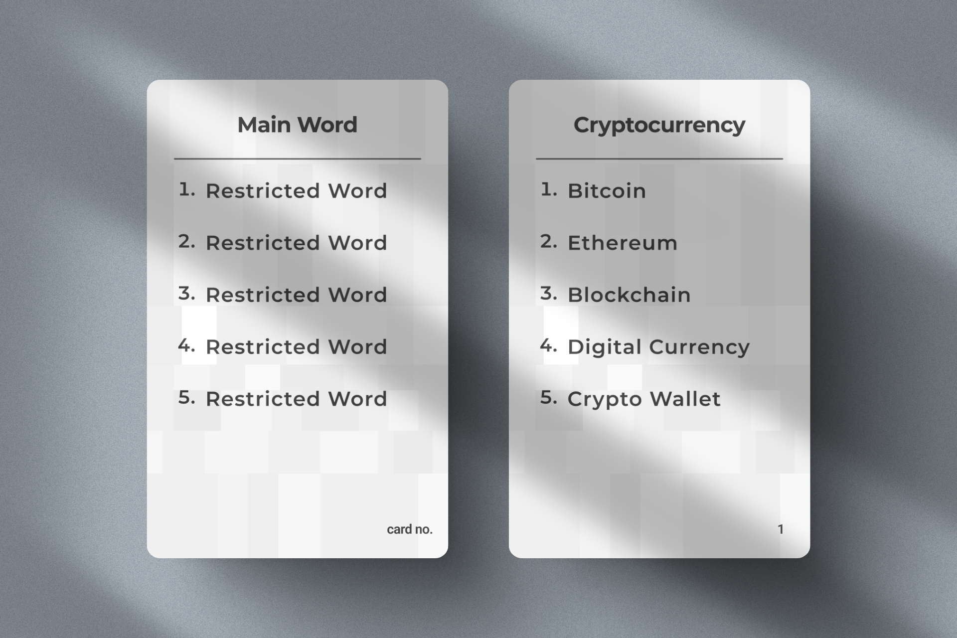
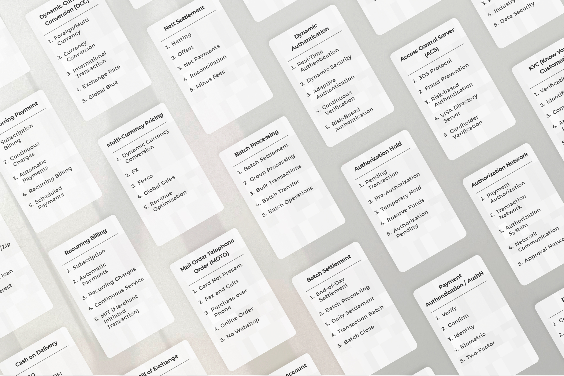
Despite the visual overhaul, gameplay remained intuitive. The card backs retained the clean, functional layout of the original — one main word and five restricted words — proving that design innovation doesn't require sacrificing usability.
Tradeoffs
| Design Dimension | Original Design | Redesigned System |
|---|---|---|
| Branding | Fixed T&P branding with no accommodation for partner logos or identity. | Modular template system allowing seamless cobranding without design compromise. |
| Visual Language | Generic minimal aesthetic with no connection to the payments industry. | Credit card metaphor creating instant recognition and relevance for the target audience. |
| Scalability | One-off production with no standardized specifications for replication. | Standardized dimensions and print specs enabling efficient multi-client production. |
| Business Value | Single-use party item with limited commercial potential. | Sustainable product line supporting partnerships, licensing, and revenue growth. |
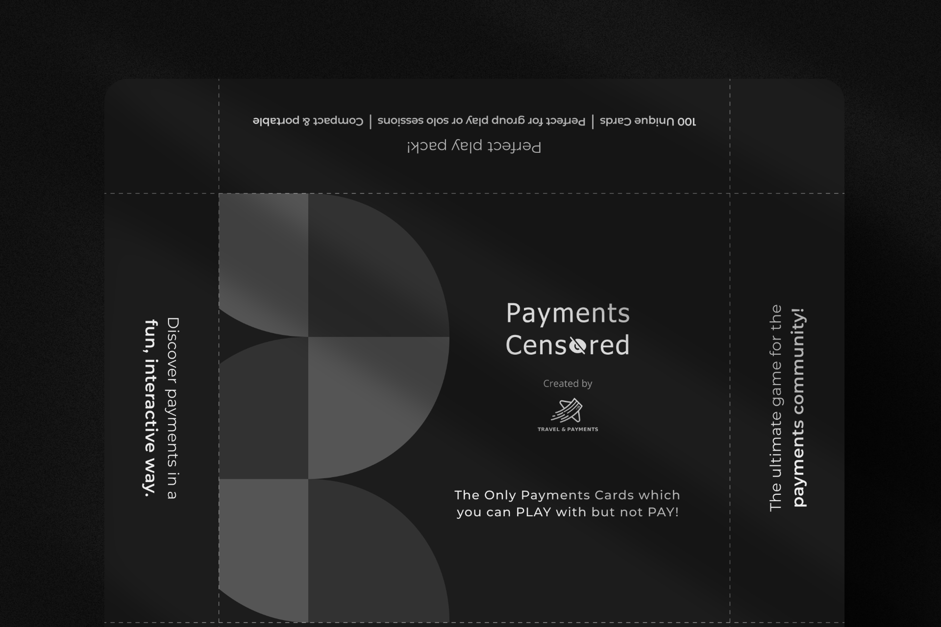
Final Screens

Final Thoughts
The redesign transformed Payments Censored from a single-use party game into a versatile marketing tool — maintaining its fun factor while serving as an effective business development asset for Travel & Payments and their partners.
Credits
Collaborators
Aniket Jadhav
Company
All work showcased in this portfolio is solely for demonstration purposes. Rights, ownership, and intellectual property for these projects belong exclusively to Travel & Payments.